These Four Colors Will Dominate Our Homes in 2021
Having spent the vast majority of the year indoors, most people are probably ready for a change of scenery. Though shelter-in-place mandates may not lift anytime soon, transforming your walls with color can have a huge affect on your mood.
"The colors you choose should be inspiring and rejuvenating," says interior designer Arianne Bellizaire. "Drab and dull colors can really wear you down emotionally, whereas bright and airy colors are much better for your psyche."
Saffron Strands by Behr Paint is a festive, optimistic shade.
With a new year comes the promise of a fresh start-and maybe a fresh coat of paint. Five industry experts-Bellizaire; Patrick O’Donnell, brand ambassador at Farrow & Ball; Arianna Cesa, color marketing and development specialist at Benjamin Moore; Erika Woelfel, vice president of color at Behr Paint, and Sue Kim, color marketing manager at Krylon-reveal the color trends that will emerge in 2021. These are the hues that will usher in a new beginning, provide healing and comfort, and instill confidence.
"I would encourage anyone to consider whether spaces are working optimally for you, especially after this challenging year," says Woelfel. "Painting can be a low-cost, high-impact project that can improve more than the value of your home, and might be a much-needed refresh in 2021."
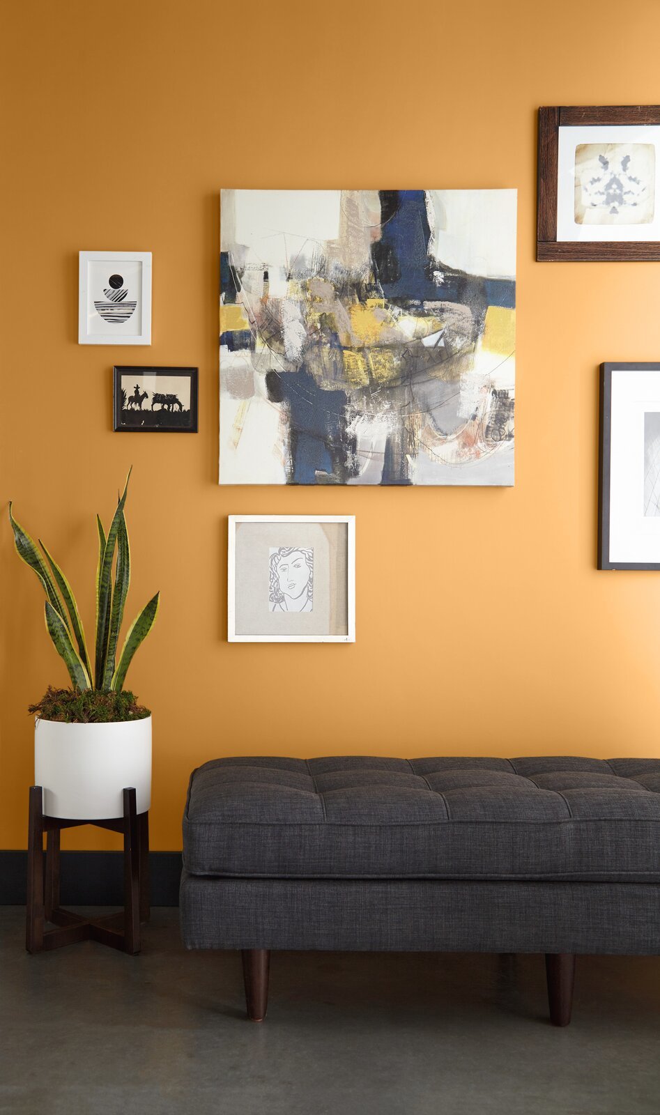
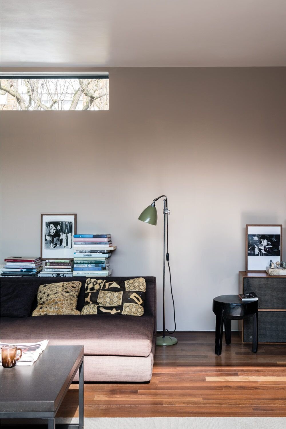
Warm Neutrals
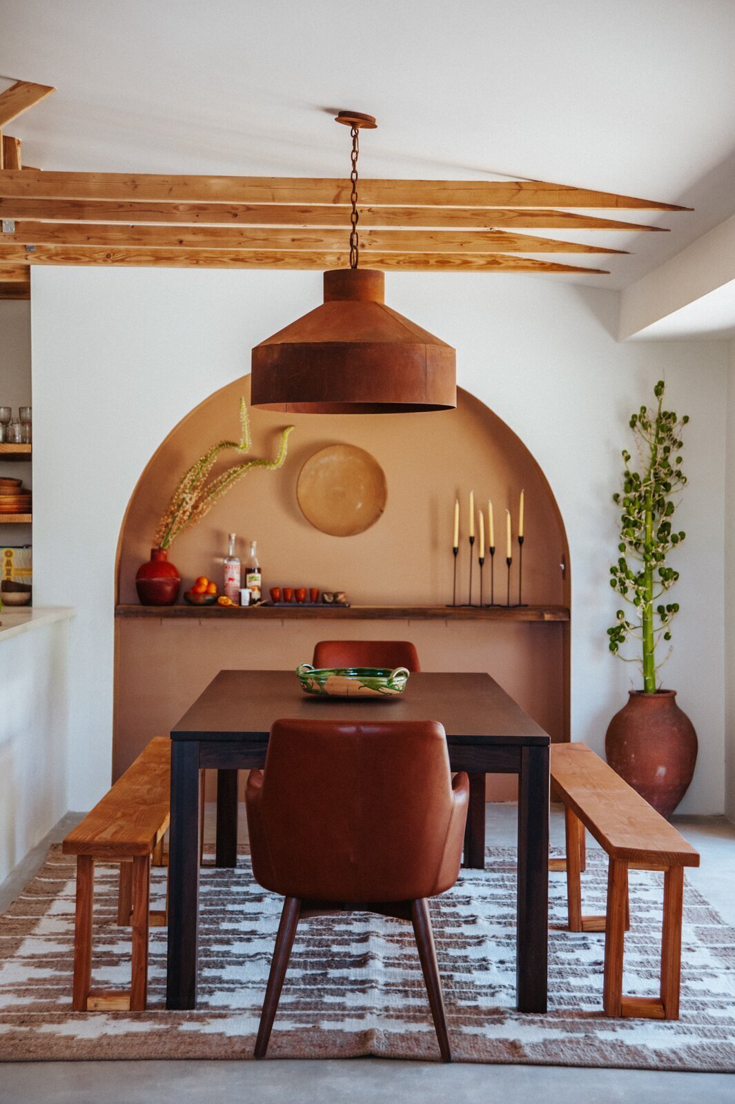
Craving more than a basic white? The experts think that warm neutrals will be used throughout the house to add warmth but still maintain flexibility.
For those who have had enough of white walls, Bellizaire anticipates taupe shades to be popular in 2021, which remain neutral while adding depth to a space. "The rise of warm taupes can really be found in the contemporary-leaning, European designs we’re seeing today," she says. "This organic trend is slowly creeping its way to the top of popular kitchen styles."
Taupe’s pink undertones flatter all skin tones, making it a natural choice for a bathroom refresh, too-but this shade can work throughout a home. "It pairs really well with black and even some warm blue, green, and gray shades," Bellizaire says. "I would recommend using matte-black metal finishes with this color."
Jitney by Farrow & Ball, though muted, is an uplifting tone that’s meant to evoke sandy beaches.
O’Donnell recommends Jitney, a brown-based neutral by Farrow & Ball, for a bedroom, and the sandy Stony Ground as a trim to offset a bold, red hue in the dining room. "Dining rooms are often more formal spaces, so it’s a good idea to go rich here," he says. "Something like Preference Red in Estate Emulsion would look beautifully dramatic, especially under candlelight. Keep the trim in a good mid-neutral, and repeat this color on your ceiling. Using a deeper tone for your ceiling will create less of a harsh contrast than the ubiquitous white."
Woelfel adds that warm neutrals can energize a space without being overwhelming. She sees them being used in common spaces that need a little pick-me-up. "I anticipate homeowners and designers will seek out [Behr’s] Almond Wisp and Cellini Gold because these colors complement changing styles and room usage needs," she says. "While Almond Wisp is a softer and more traditional neutral, Cellini Gold is a confident and inviting antique gold that’s fun and unique. I love matte-black finishes with Almond Wisp and pewter or dark bronze with Cellini Gold." And as for more private spaces, she sees Canyon Dusk and Modern Mocha being popular options.
Kingsport Gray is part of Benjamin Moore’s Historic Color collection.
Warm neutrals will be used as "building blocks" between rooms to connect a palette, especially in gathering spaces, says Cesa. "With a perfect balance between warm and cool, try pairing [Benjamin Moore’s] Kingsport Gray in an eggshell or flat finish with a deeper hue like Silhouette," she says. "Or play to its cooler side by pairing it with a Gray Cashmere trim." Foggy Morning, she says, would work in bedrooms and bathrooms.
Dramatic Black
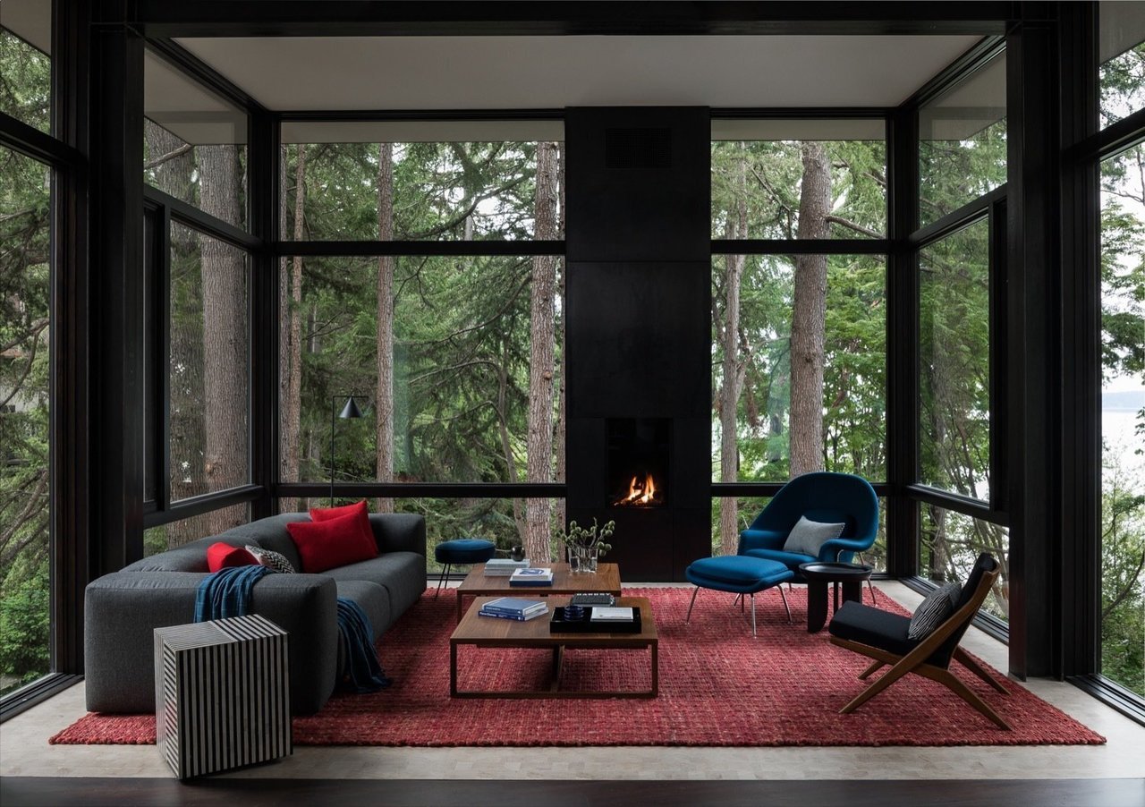
Kim notes that black walls will trend as homeowners seek out a clutter-free home.
"We are seeing blacks take a more prominent position in rooms like kitchens and bathrooms that have a slightly more contemporary lean to them," Bellizaire says. "And like whites, blacks work with just about any other color in the spectrum." What was once too stark to play anything but a supporting role is now embraced as a way to bring sleek sophistication.
"The desire to declutter and simplify the mind is making a renewed focus on iconic colors like [Krylon’s] Matte Black," adds Kim. Bellizaire recommends using the shade alongside whites and wood tones for a rustic finish that still has depth, or accenting with metals like polished nickel and unlacquered brass for a more contemporary look. Kim would also pair black with a chalky, but equally classic, white. "Low-sheen and soft-touch finishes elevate the look," she says.
With a hint of black, Amazon Soil by Benjamin Moore is a velvety mauve that inspires calm.
If black is too much of a statement, Cesa recommends using it as an undertone in a shade that’s a bit brighter, like the luscious purple of Benjamin Moore’s Amazon Soil. "Darker colors can create restful, comforting spaces to relax and unwind," she says. "Amazon Soil is an intriguing, smokey take on purple. For a more rich, luxurious feel, I love it in a matte finish paired with Muslin. For a higher contrast and complementary color combination, you could try it with Chestertown Buff."
Natural Greens
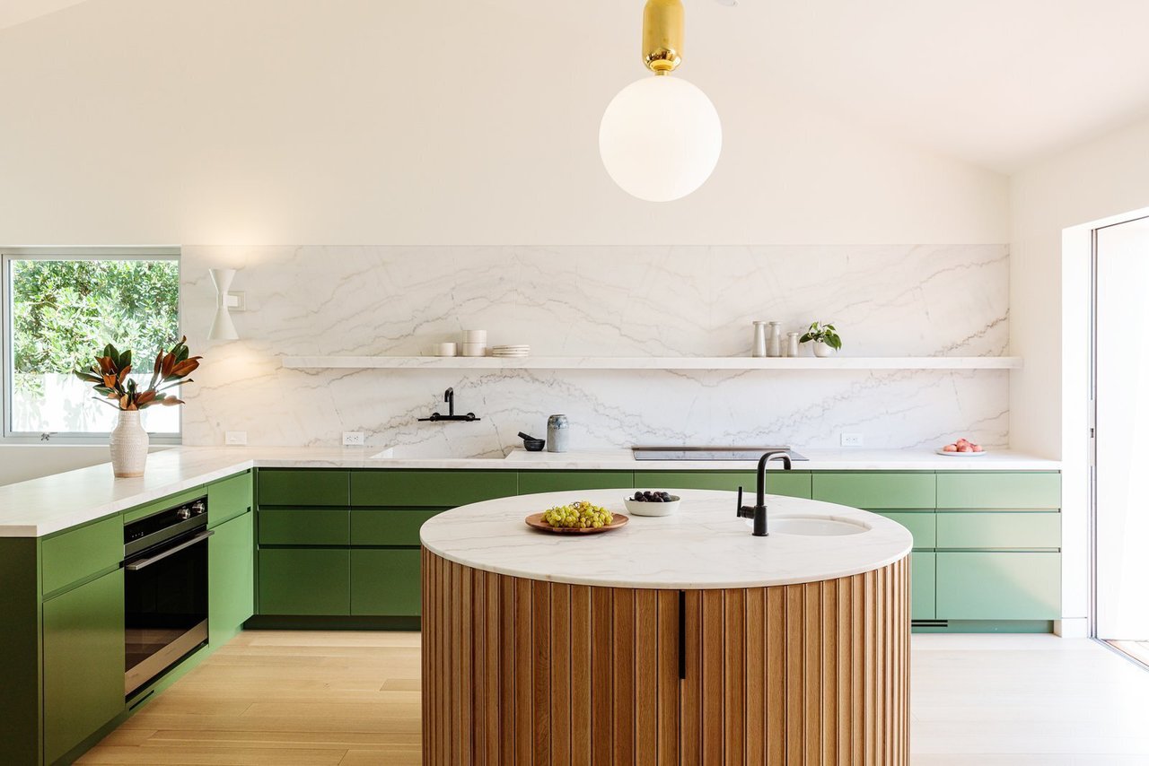
O’Donnell anticipates green being a popular shade for kitchen cabinetry and living spaces in 2021.
O’Donnell predicts that green, a popular color that promotes coziness and relaxation, will look especially inviting in living rooms. "Greens always exude calm, an essential state of mind for our busy lives," he says. "Consider Sap Green [by Farrow & Ball], which is strong but has an underlying brightness running through it."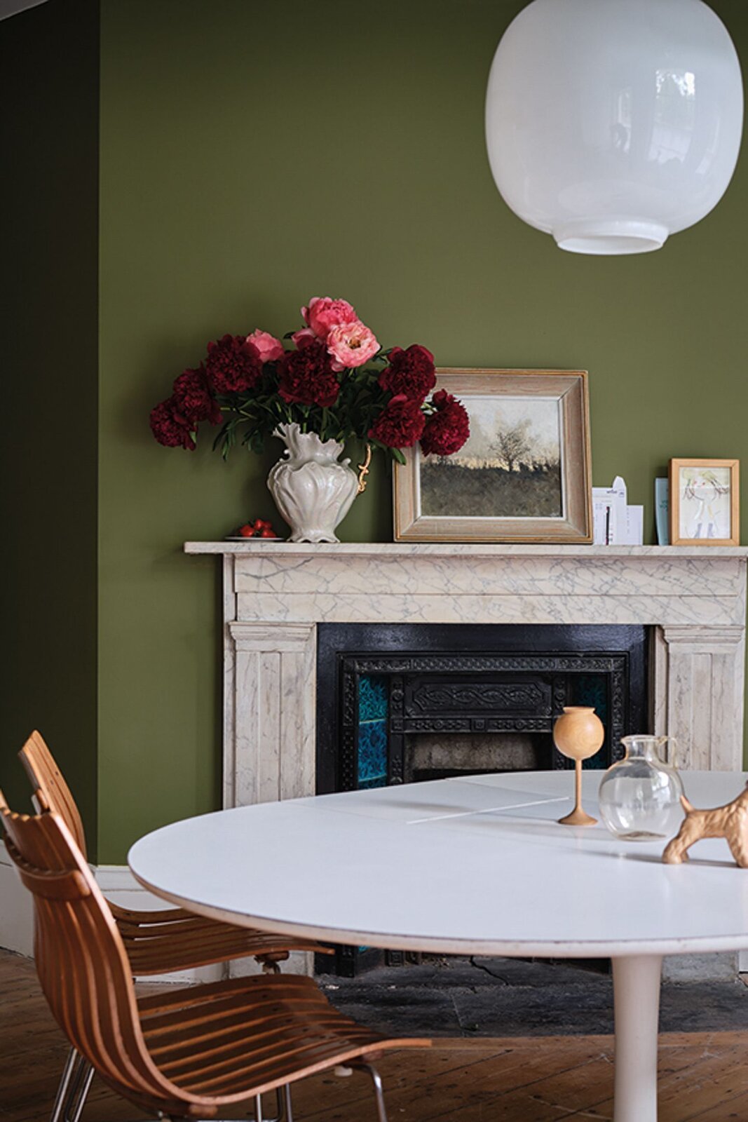
Farrow & Ball’s Sap Green is a soft, earthy hue.
He also encourages people to be "adventurous" with the details by painting surrounding woodwork in an unexpected shade like Broccoli Brown. This will strengthen the feeling of nature even more-a positive, after so much time spent cooped up-while creating a captivating statement overall. O’Donnell thinks more kitchens will feature the color, too. "Green Smoke in Modern Eggshell is a timeless shade, and it works best below eye level on lower cabinets," he adds. "It can be combined with Shaded White on your upper cupboards." 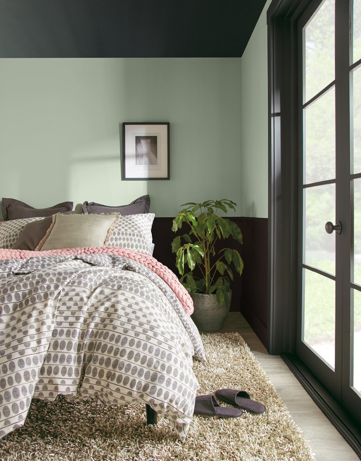
Jojoba by Behr is a dusty, pale green that promotes tranquility.
Kim foresees green being used as a peaceful backdrop in multifunctional rooms. "Symbolic of peace, [Krylon’s] Satin Jade is a perfect blue-green that reflects the renewing power of nature," she says. "It can be paired with nurturing Satin Pistachio to emphasize a healthy lifestyle at home." Woelfel advises that a softer shade of green, like Behr’s Jojoba, would look great in a bedroom. "I love pairing Jojoba with Royal Orchard, and they would look beautiful with dark gray or black wood accents," she says.
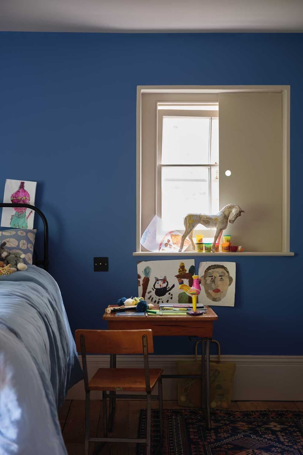
Serene Blues
Woelfel sees coastal blues becoming prevalent in bedrooms, either on walls or as part of the furnishings.
It should come as no surprise that blue, a shade most often described as calming, makes the cut. "There are so many beautiful shades of blue to choose from," Bellizaire says. "Blues pair well with whites and greens for relaxing space, and I consider blues to be more timeless than trendy."
Farrow & Ball bills its Ultra Marine Blue as a "romantic, mid-toned" hue that’s been popular since the 18th century.
One room that always looks good in blue, according to O’Donnell, is the bathroom. "It contrasts perfectly with the classic white details most of us have in this room," he says. "For next year’s shades, think [Farrow & Ball’s] Ultra Marine Blue in Modern Emulsion (to tolerate moisture) for walls, paired with All White in Estate Eggshell on woodwork. You could even carry the Ultra Marine Blue over the ceiling for a lovely design statement."
Woelfel sees homeowners and designers responding to Behr’s Dayflower in bedrooms, which she’d pair with Modern Mocha. For those looking for a "wow" factor, Kim has it. "If you’re feeling inspired to stain an old wooden dresser to complete the look of your bedroom, try Minwax stain in its Color of the Year, Vintage Blue," she says. Matte Ink Blue is also a perfect addition to today’s home."