The major trend right now? Clashing your colours - and here's how to do it like a pro
This London Fashion Week did nothing so mundane as to spurt out trends for the sake of it. Instead, designers took a considered approach to creating clothes that - if you’re in the market to buy - will fit seamlessly into your existing wardrobe and stay special for years to come.
When you’re in the business of decoding trends there are always elements of style that will stick out - it’s always more than coincidence when more than three pairs of flared trousers appear in different designer’s collections. But what really caught our eye over the week was the way unexpected colour combinations were styled together and provide inspiration way further than just presenting cool new things to buy.
Perhaps it’s because of the monotone year we’ve had (and that’s putting it politely) that made some of London’s biggest labels look to the brighter side of the rainbow, but the optimistic mood that can be inspired by putting on a cheery colour can’t be denied. What’s fresh is what those colours were teamed with.
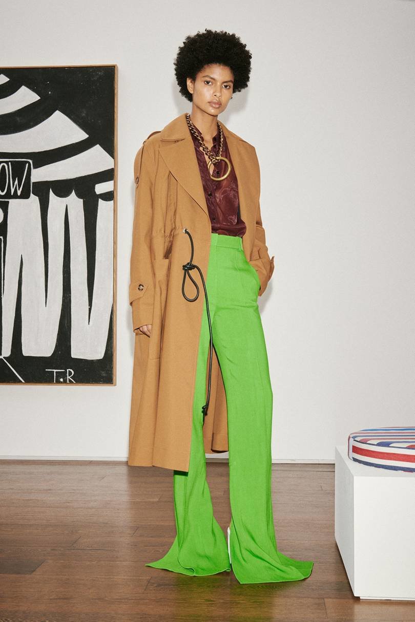
At Victoria Beckham, an eternally chic camel coat was worn with a chocolate silk blouse and gold jewellery. So far, that’s an elegant uptown colour combo, but adding in highlighter green flares was an inspired jolt to the senses. Adding a super-bright shade to classic neutrals still feels polished when the silhouettes are all classic, but your outfit won’t look staid because you’re wearing neon.
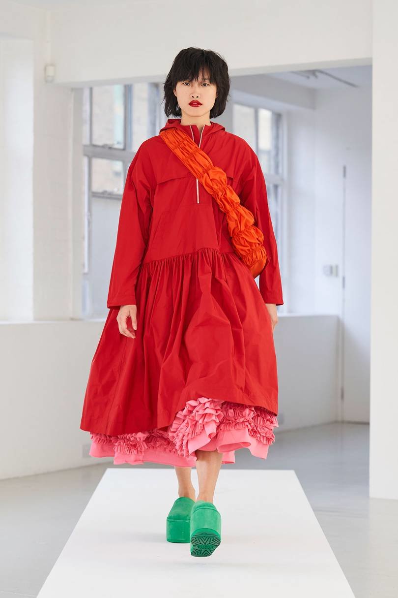
It’s an old art school tip that colours opposite each other on the colour wheel will always go together, but picking the shades next to each other (as at Molly Goddard, who went for pink, red and orange) is also guaranteed to ‘go.’ The shades are bold but because they are in casual shapes (that scarlet anorak-dress is on our wishlist already) they’re easier to wear all together. The pop of spearmint keeps it looking fresh
Charlotte Knowles is another label who has picked colours next to each other and made them work as her pumpkin, yellow and peach look proves. The clashing element comes from lime green hair - it’s optional.)
If you’re unsure of how to make a shade work for you, look to Erdem who showed the lightest lemon / lime silk striped dress with a chunky khaki cardigan. The two tones of one colour - both are essentially versions of green - will sit together easily but still look styled because you’ve chosen colours from either ends of the same shade spectrum.
If you’re feeling bold, the best way to style yourself for ultimate impact is by wearing one colour head to toe. At Richard Malone the mustard shade on the long sleeve tunic, flares (ok there are SOME trends for Spring 2021), heels and socks look coherent and pulled together. Choosing one colour head to toe is always a fail-safe option and even if mustard isn’t your spicy sauce, you could try navy, camel or burgundy to the same effect.
We haven’t seen brights worn with black for several seasons but for Spring, the self-painted designs of Christopher Kane (which made it from canvas to clothes) are the perfect mix of multi-colour edged with black. If you’re wearing any busy print, by picking out one colour for you accessories (like black with this look) brings the pattern back to earth and gives it a chic edge.