The 9 Best Ceiling Paint Colors (Beyond White), According to Designers
For many, ceiling colors are an afterthought. In fact, many have only lived with various shades of matte white. While crisp, bright shades will always have their place, today’s top designers are creating uniquely soothing interiors by showcasing soft shades of color up above.
For traditionalists, sticking with white can be a safe bet. But if you’re looking to capture a designer look or try something new, consider a soothing shade from nature for your ceilings. “I love opting for soft shades of blue on a ceiling for a wow factor,” says Nicole Gibbons, interior designer and founder of Claire Paint. “It gives the feeling of a fresh, open sky and brings calm to a space.”
Whether neutral, serene, or slightly statement-making, these expert-recommended ceiling paint colors can elevate your rooms and foster feelings of peace and tranquility.
Stone Harbor, Benjamin Moore
Bria Hammel of Bria Hammel Interiors chose Benjamin Moore’s Stone Harbor in an elegant satin finish for the ceiling of a recent project. “We knew we wanted to paint the shiplap ceiling of this sunroom a contrasting color, but wanted to make sure it wasn’t too loud or overwhelming,” she said. “This beautiful, warm gray was the perfect choice. We love that it draws your eye up but still makes the room feel light and airy.”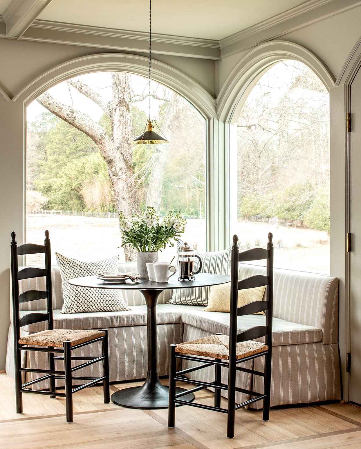
Gateway Gray, Sherwin-Williams
For those with ceiling beams and architectural details, Sherwin-Williams’s earthy shade Gateway Gray is a lovely choice. Designer Alison Giese of Alison Giese Interiors turned to this ceiling color for a home with beautiful views of nature. "To further drive the drama in the space, we painted the ceiling Pure White and chose to paint the trim and beams Gateway Gray,” Giese says. “The result is an airy yet layered and inviting space for our clients to enjoy their morning cups of coffee.”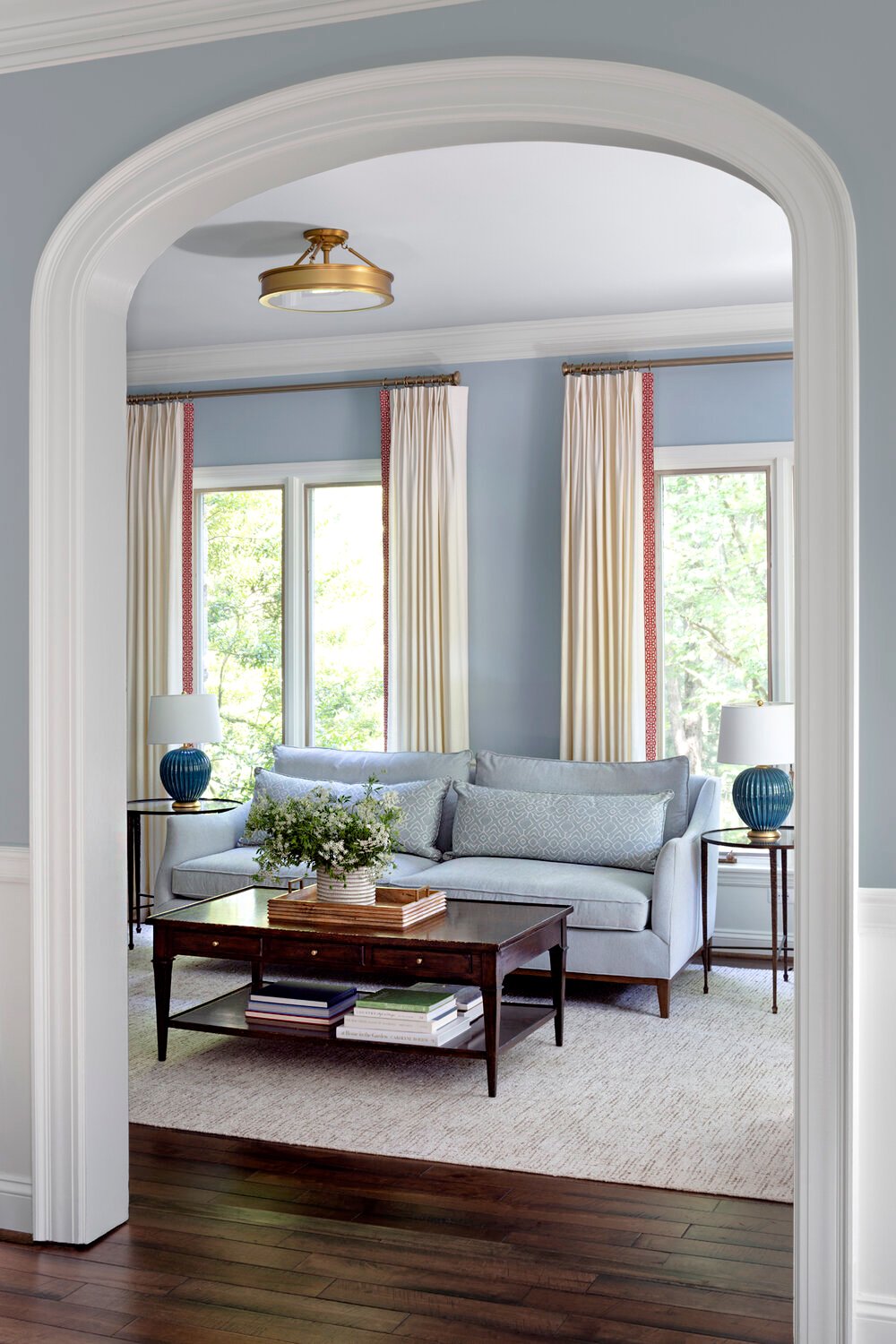
Silvery Blue, Benjamin Moore
Designer Laura Hodges of Laura Hodges Studio recommends Silvery Blue by Benjamin Moore. “I chose this silvery blue color to closely match the wall color and continue the calming palette up onto the ceiling,” she says. “Painting the ceiling a similar color to the wall allows the room to feel bigger, rather than stopping your eye at the ceiling plane. This soft, powdery blue also resembles the color of the sky and complements the lush surrounding landscape.”
Studio Green, Farrow and Ball
For Mary Patton of Mary Patton Design, Farrow & Ball’s rich forest shade Studio Green is an ideal choice. “For this client’s master bedroom, we painted the walls and ceiling Studio Green and painted all of the trim cream,” she says. “The room is very large so we were originally tasked with making the vast space feel cozy. Painting the ceiling a darker color such as this deep green allowed the room to feel more warm and sumptuous.”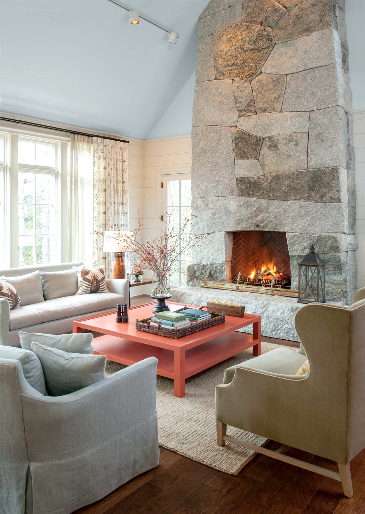
Pale Smoke, Benjamin Moore
For cathedral ceilings, designer Linda Banks of Banks Design Associates recommends Pale Smoke by Benjamin Moore.“This color is what I call a ‘chameleon color.’ I have a few in my repertoire that change with light and the weather, and this is a classic example,” she says. “I find that when it is painted on a ceiling it ‘dematerializes’ the ceiling and makes it seem like it’s floating away. The atmospheric character of Pale Smoke is like no other.”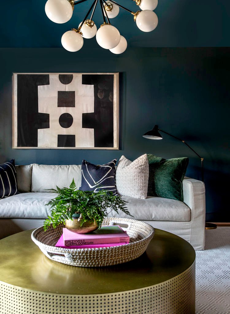
Mount Etna, Sherwin-Williams
Shannon Crain of Shannon Crain Design used Mount Etna by Sherwin-Williams on the walls and ceiling of this glamorous living room. “I wanted it to feel bold, but cozy at the same time and Sherwin-Williams' Mount Etna felt like the right color for movie and game nights with family,” she says. “I carried the color onto the ceiling because I wanted the room to feel like stepping into a special place for togetherness. The sort of space that wraps you up and invites you to get comfortable.”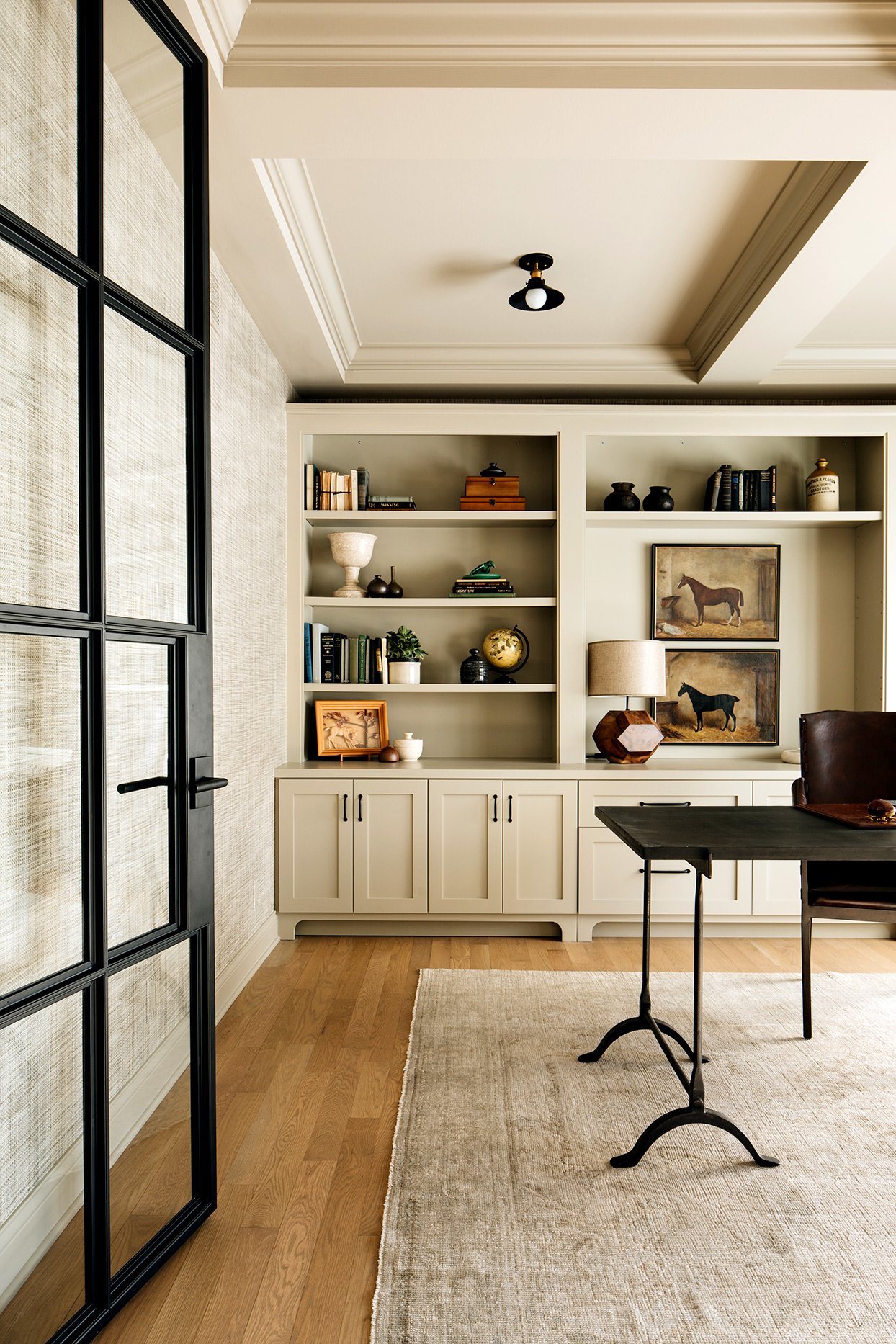
Finnie Gray, Benjamin Moore
Alessia Zanchi Loffredo of Chicago’s reDesign Home used Benjamin Moore’s Finnie Gray on the ceiling of this monochromatic study. She says the room’s uniform palette creates “a calming, soothing, and elegant vibe” ideal for working from home. This sandy shade works beautifully with other colors and textures, allowing lighting and decorative elements to shine.“It allows the pairing of many additional color tones such as shades of green, black, brown, gray, and ivory as well as steel, wood, brass, bone, and vintage finishes,” Loffredo says.
Skylight, Farrow and Ball
Mary Patton of Mary Patton Design used Farrow & Ball’s Skylight on the ceiling in this modern living space. “We originally wanted to wallpaper the ceiling, but because of budgeting, we went the affordable and cheerful route of paint,” she says. “I selected a soft blue-gray to subtly draw attention to the fabulous Tom Dixon pendants. This also helped tone down how glam they are, as well as pulling blue from the antelope rug.”
Onyx, Benjamin Moore
Emma Kemper of Emma Beryl Interiors chose a stormy gray shade called Onyx for her client’s bedroom ceiling. “Whenever I use a dark paint color or wallpaper in a room, I think it’s extremely important to carry the dark tones onto the ceiling to avoid a high-contrast white ceiling that looks forgotten about,” Beryl says. “I love that Onyx by Benjamin Moore has depth and dimension that makes your ceiling appear larger and higher than it is.”
Expert Advice for Choosing a Ceiling Color
To achieve a consistent look that pairs well with your current wall color, Loffredo recommends using the same wall color for the ceiling but changing the finish to flat.“If all the trimwork is Sherwin-Williams' Alabaster, then I continue the Alabaster on the ceiling, but I change the sheen,” she says. “If a room doesn’t feature trimwork such as crown molding, then I’d continue the color of the wall onto the ceiling and change the sheen." This creates relaxing consistency within the space while also adding polish.
Ultimately, giving your ceiling color consideration throughout the design process can go a long way, no matter the color you choose. “Painting your ceiling can really elevate your space,” Gibbons says. “If you’re going for white, it can take your space from feeling drab to looking fresh and bright. And if you opt for a color on your ceiling, it is a fantastic way to draw the eye up while also bringing a sense of drama and high design to your room.” For a reliably soothing ceiling shade, Gibbons recommends Headspace as well as the traditional crisp-white Snow Day.
As with all painting projects, test your samples in the room you plan to paint. Checking in on them throughout the day can help avoid mistakes as natural and artificial light can change the appearance of color once it’s on the wall.