15 Designer-Approved Color Trends for 2020
Any interior designer will confirm that color has the power to transform a room, whether it’s a bold accent wall or an unexpected painted ceiling. But pinpointing the perfect color for your space can be quite tricky sometimes, so we’ve decided to consult with top designers and color experts for a bit of direction. What colors will continue to dominate homes in 2020? From rich, moody hues to elegant neutrals, here are the top colors you’ll be tempted to incorporate into your space in the year ahead.
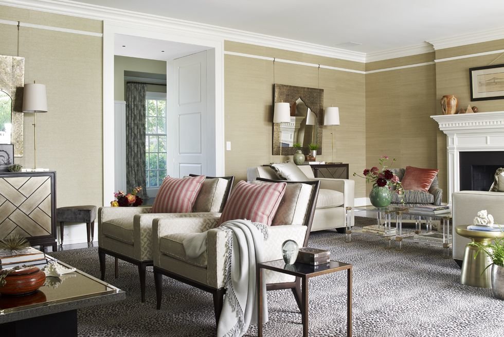
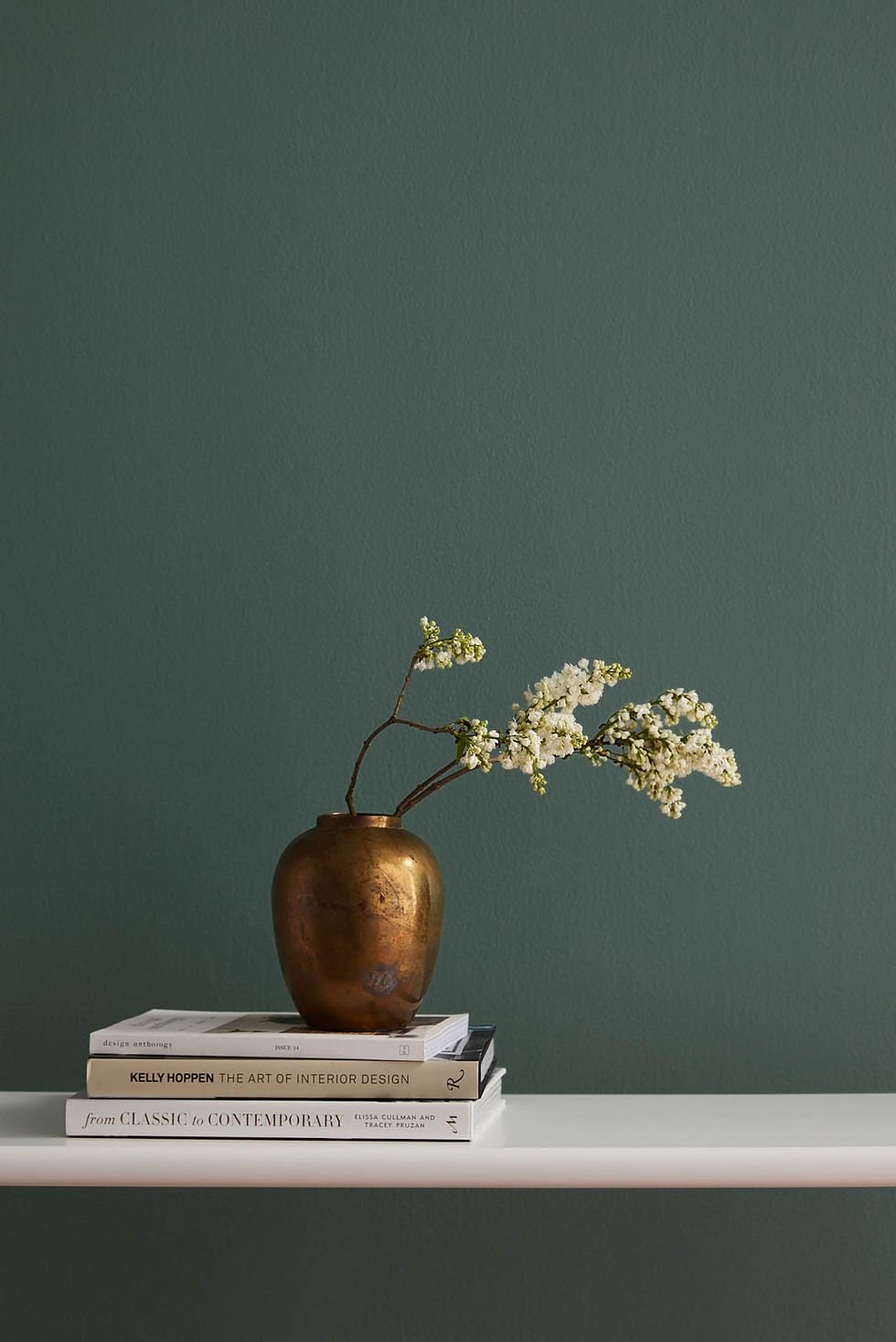
Ocher and Magenta
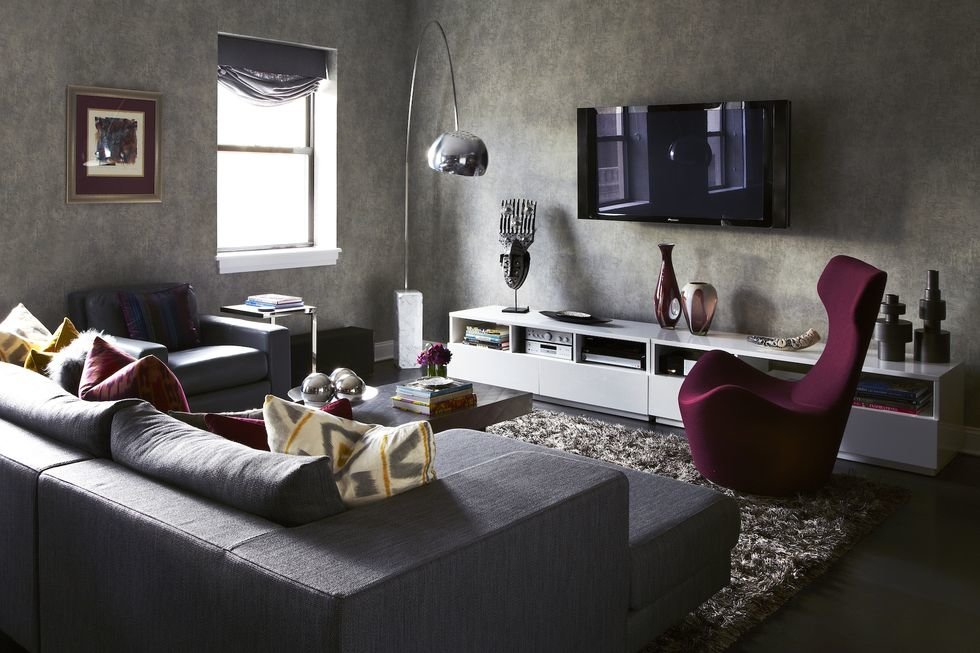
“Jewel tones come back in style over and over again as a go-to for adding some punch and pizzazz to any interior. Whether featured in saturated jewel-box rooms or as pops of color in a more neutral space, they always do the trick in creating environments with drama and flair. Here, the deep magenta paired with ocher yellow (and teal) give some much-needed oomph to this monochromatic gray space.” -Danielle Colding of Danielle Colding Design
Warm Creams
“I love warm creams and lovely stone colors-colors that leave me feeling grounded. I’ve also found myself leaning into terra-cotta tones. I love washing an entire room in the same color and finish with a linen or stone. I expect to see a lot of these natural, earthy tones for the remainder of 2020.” -Jade Joyner of Metal + Petal
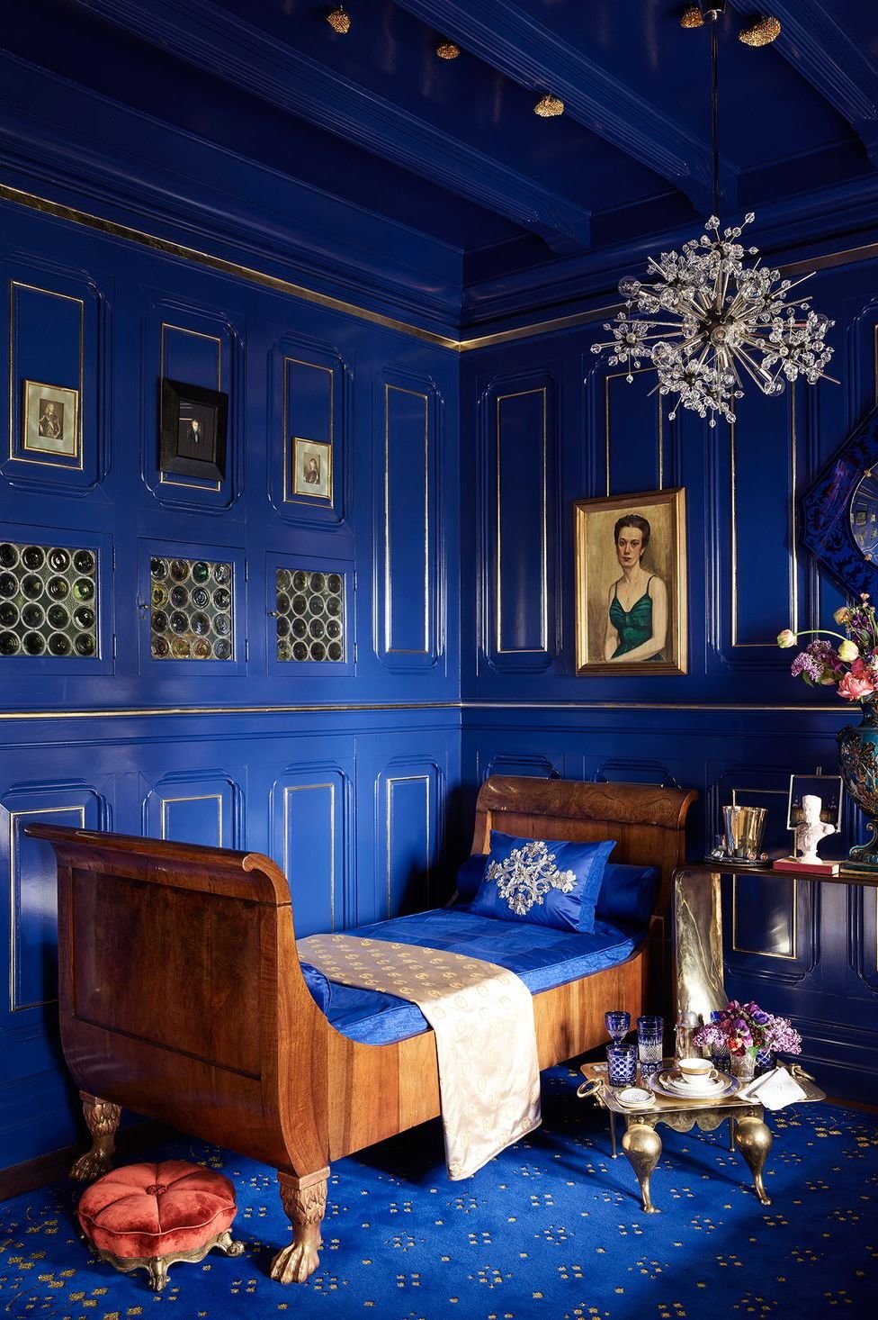
Navy Blue
“I think navy blue will continue to dominate the remainder of the year. Blue is classic and the ‘new neutral,’ which I totally support! With Pantone’s 2020 color of the year being Classic Blue and Sherwin-Williams’s color of the year as Naval, I definitely don’t see blue losing popularity any time soon.” -Ashley Moore of Moore House Interiors
Blue-Gray
“In today’s environment, I’m looking to find colors that are calming. A nice blue-gray evokes wellness.” —John Cialone of Tom Stringer Design Partners
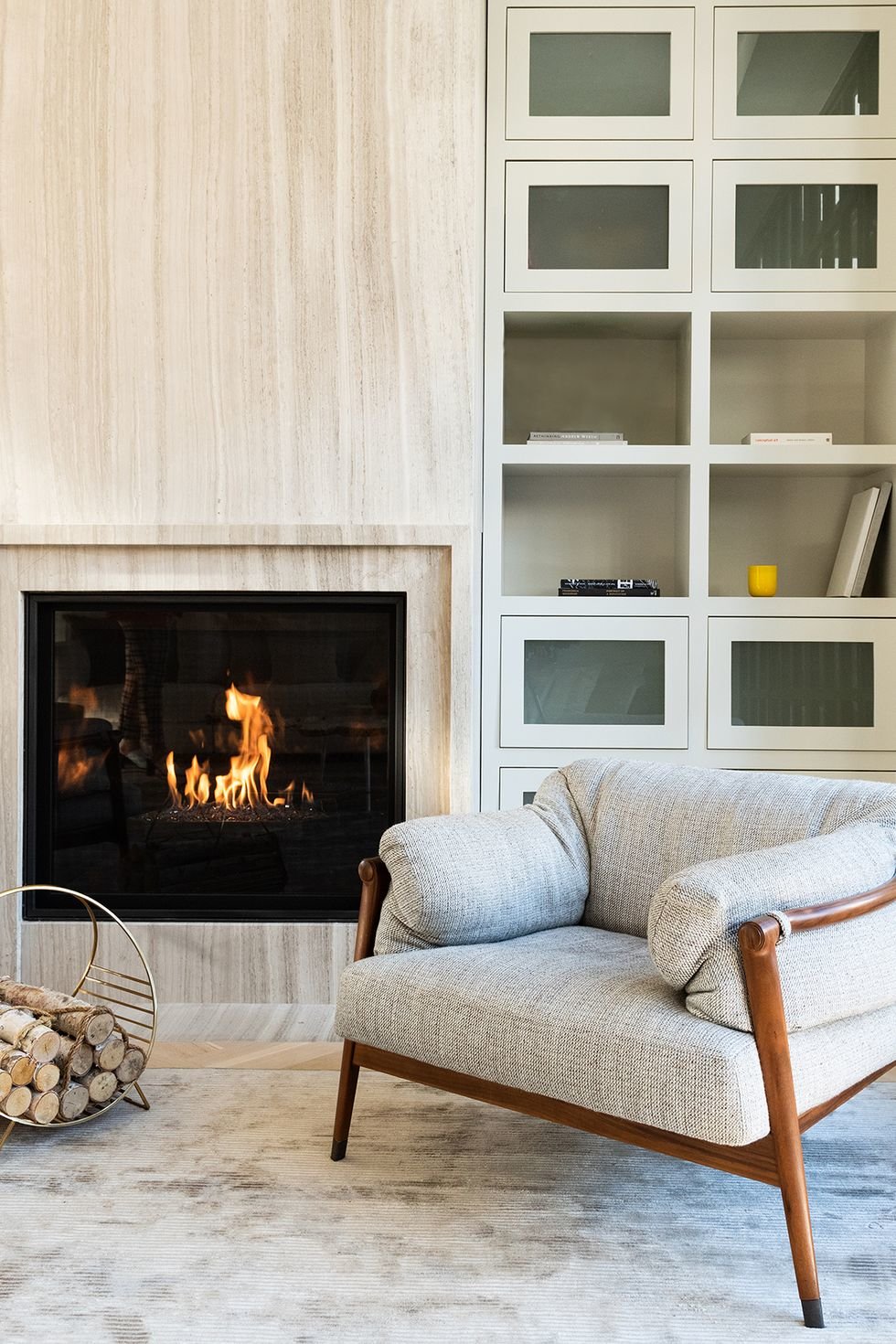
Deep Avocado Green
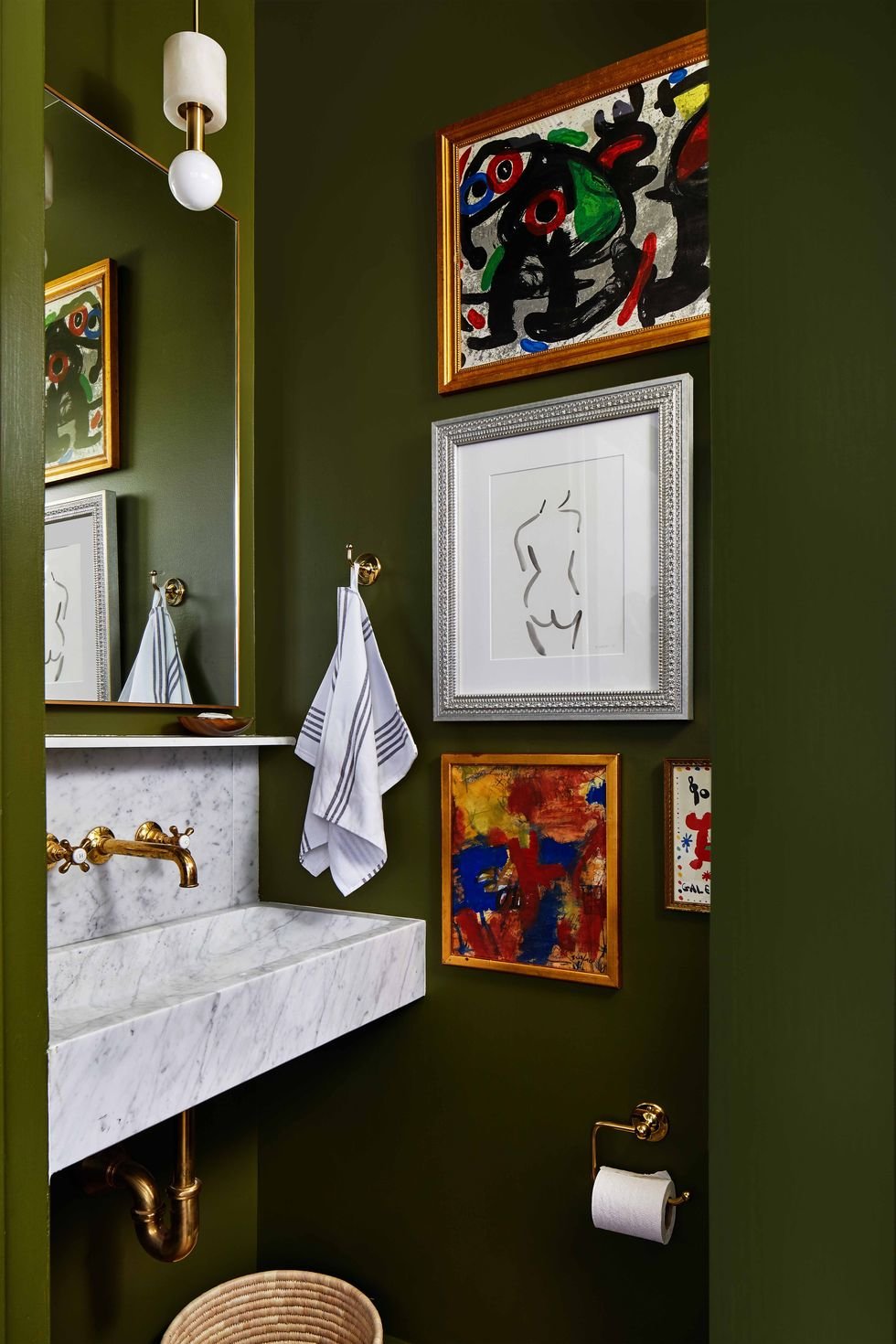
“Deep avocado green is everything to me right now! When the world outside gets scary, your home-no matter what size, where it is, or whether you rent or own-goes into nurturing overdrive. And that’s what dark, velvety hues do best: They bring the cozy like nobody’s business. Saturated, rich avocado green is actually a blend of almost every color in the rainbow, so it goes with everything. I’m loving it enlivened with strategic pops of brights, white, and ebony to add warmth and drama to the cocooning factor.” -Elaine Griffin of Elaine Griffin Design
Warm Pastels
“Pastels are still hugely popular, but I think we’re gravitating toward pastels with added warmth and earthy undertones. For overall color palettes, we’re using a mix of both spring and autumnal colors.” -Young Huh of Young Huh Interior Design
Bold Monochromatics
“Monochromatic does not have to be pale. Colors like cobalt blue, kelly green, or even aubergine can evoke monochromatic in a daring way that’s full of personality and elegance.” -Jonathan Rachman of Decorist
Dusty Teal
“My new color crush is a dusty teal. It is actually an amazing neutral that pairs well with so many colors: camel, rust, navy, peach, and pale woods, such as white oak and birch. Plus, I love colors that are deep and calming at the same time.” -Amy Sklar of Amy Sklar Design
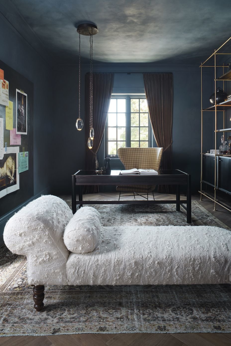
Moody Hues
“When it comes to paint colors at Clare, we believe in timeless over trendy. We think people will always prefer more timeless neutrals. But when it comes to colors that have been unexpectedly popular, we’re definitely seeing a trend toward rich, moody hues. Current Mood is the number two most-visited color on our website and gets a ton of love on Instagram. It’s also a top five best-selling color, and outside of this rich green shade, we’re seeing more of an interest in deeper, moodier colors.” -Nicole Gibbons of Clare
Organic Tones
“In 2020, we’re going to see a shift away from the cool color palette that defined the last decade and toward warmer, more organic tones. Warm neutrals and tones in place of cool grays and blues will be much more popular for colors this coming year.” -Cheryl Eisen of Interior Marketing Group
Black and White
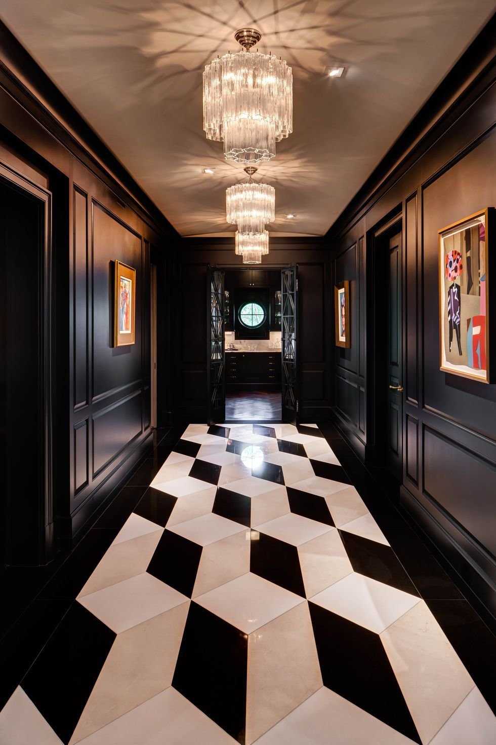
“High-contrast black and white is such a dynamic duo. While versatile, I prefer a bold pattern, like Art Deco ziggurat tile, for a little drama. The emotional response is immediate, and the look remains timeless.” -Laura Umansky of Laura U Interior Design
Blue, Green, and Gray
“We are embracing rich, saturated blue, green, and gray colors that change based on the time of day and light in the room. They immediately create a mysterious, sexy, and interesting space.” -Kristen Peña of K Interiors
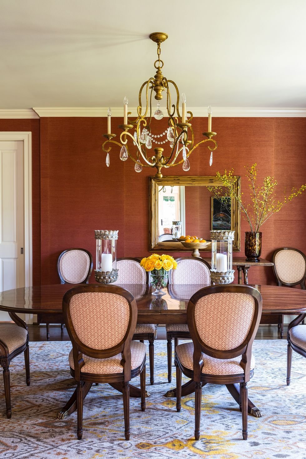
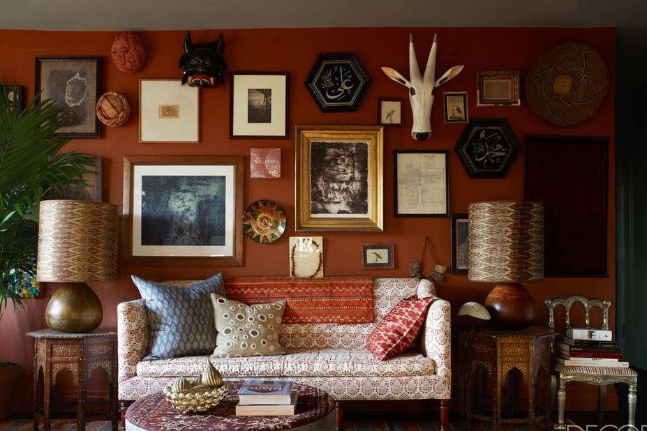
Earth Tones

“Say goodbye to the cool tones that have ruled for so many years. Shades of chocolate brown, wine, olive green, and ocher are all taking over in homes. We love substituting these warm, natural colors for a neutral on the sofa or walls.” -Marika Meyer of Meyer Interiors
Blues, Greens, and Rich Jewel Tones
“The year 2020 is the start of a new decade, and in true roaring ’20s fashion, we’ll start seeing a trend toward bolder, deeper colors accented with a touch of opulence. After a decade filled with all-white kitchens and gray everywhere, I’m hopeful that homeowners will begin to embrace color-from nature-inspired greens and blues to rich jewel tones-and take more design risks.” -Sue Wadden of Sherwin-Williams
Punchy Colors
“No fear! I love ikats with crazy, punchy color combinations that don’t back down. I’m seeing a lot every time I travel-prints with a caravan of colors.” -John Robshaw of John Robshaw Textiles