Did The Runways Predict the 2021 Pantone Color of the Year?
This year has abounded with baffling information: What is the Monolith? What was that running down Rudy Giuliani’s face? Why were Ana de Armas and Ben Affleck always going on all those walks? Wondering about the mysteries of our strange-and-getting-stranger universe is an occupation in itself.
So, here we are with yet another unknowable truth: the Pantone Colors of the Year. For the second time in the organization’s 20-history of assigning colors to calendar years, its governing body has chosen two hues: Ultimate Gray and Illuminating. Yes, gray and yellow are the standout colors of 2020-not COVID virus red, not surgical mask pale blue, not Insta-activist graphic pastel pink, suffragette white, or the deadened charcoal of the camera-off function on Zoom. I understand that last year at this time the organization already chose its most digital color-a shade called Classic Blue used for links-but gray and yellow feel somehow off.
“We will ask what is happening in socio-economic terms in the world to make sure that we pay attention to what the public at large is telling us, what their needs are, what their hopes are,” Leatrice Eiseman, the executive director of the Pantone Color Institute, told my colleague Julia Hobbs. “With that information gathering, we can do our homework and come up with an intelligent analysis that enables us to decide on the color.”
The most intelligent analysis might in fact lead to the realization that the big energy of 2020 is actually off. The Pantone Color of the Year was something once so known, so certain, so obvious, and now it has joined the ranks of things we once counted on-time, space, existence, etc.-that have since become unknowable.
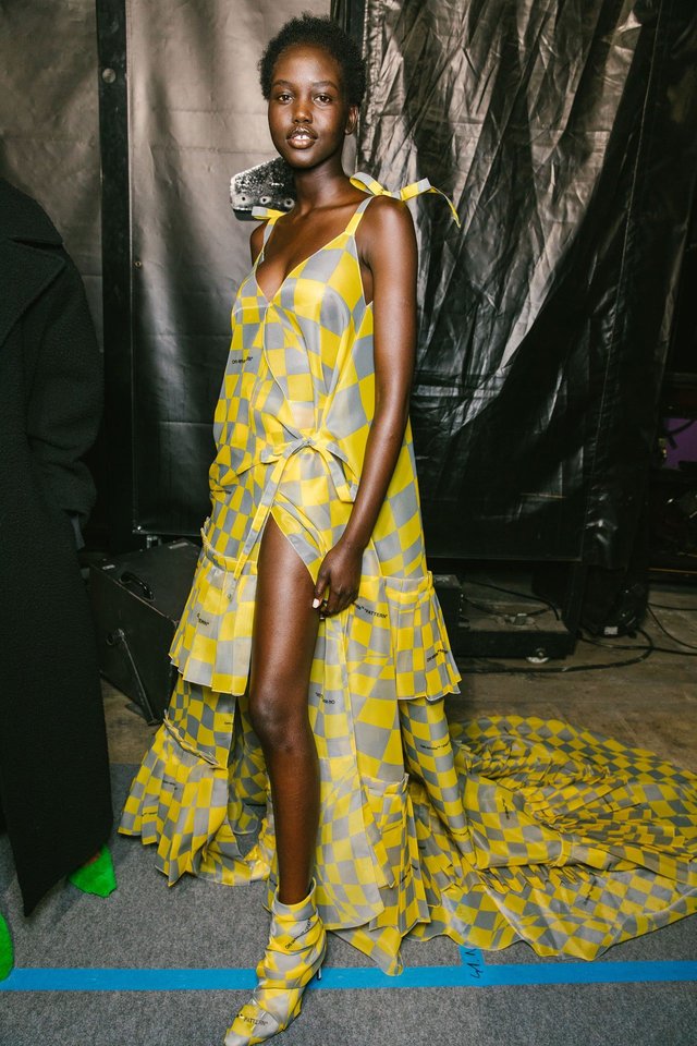
The 2021 Pantone Colors of the Year are also quite “Off.” Off-White’s fall 2019 show, “His & Hers,” took place on a checkerboard of yellow and gray squares and closed out with Bella Hadid in shorts and a jacket in the same pattern. One obvious thought: Just as Virgil Abloh sends up mainstream references, so shall Pantone send up Virgil Abloh. I messaged Abloh about the coincidence. “NO WAY WOW” he wrote back.
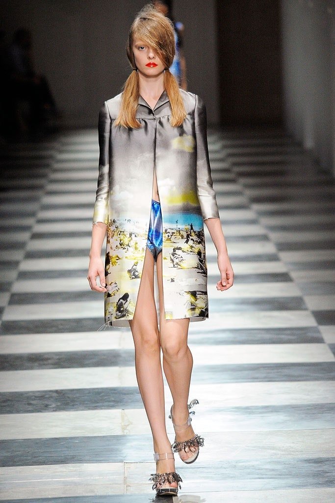
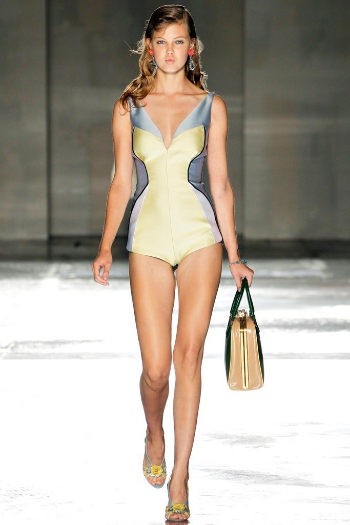
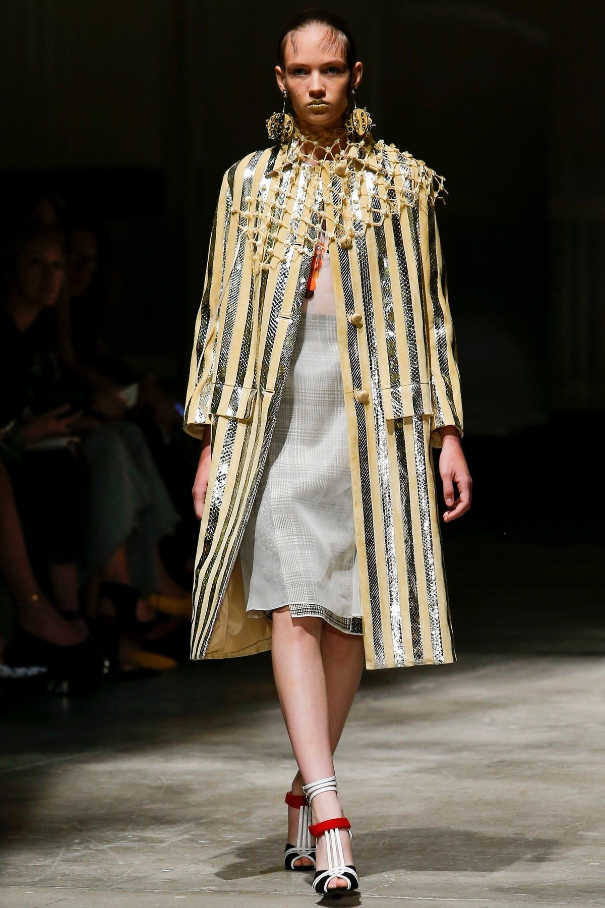
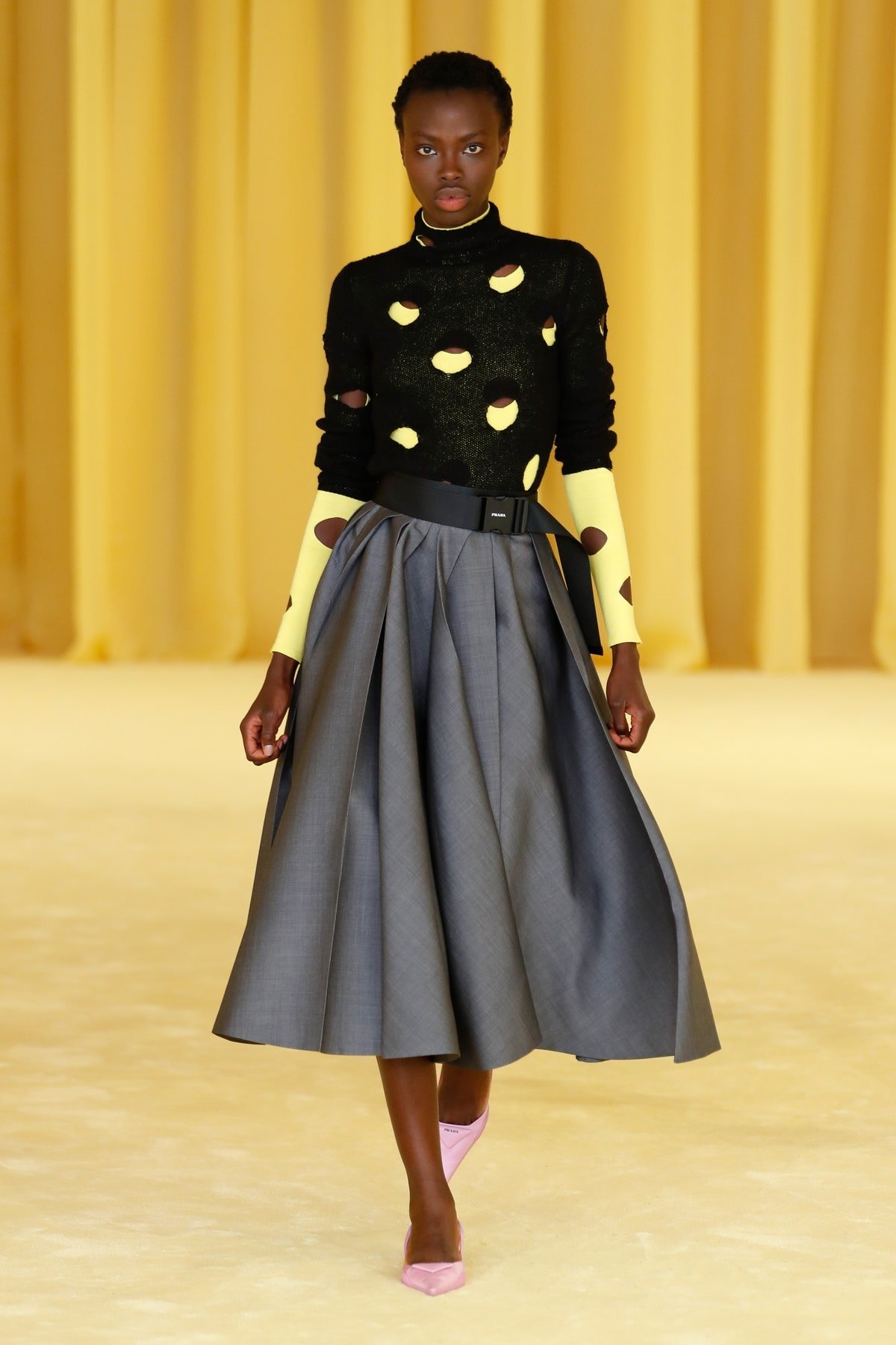
Pallid gray and sun yellow also happen to be quite beloved Prada hues as well, with Mrs. Prada referencing them time and again since her 1987 debut. A vexing color palette is, in many ways, the racing pulse of a Prada experience: Something that is confusing at first, maybe even ugly, that becomes over time and with analysis, lovely, coveted, and worthy of revisiting. Other designers including Sarah Burton, Alessandro Michele, and Demna Gvasalia-creatives, like Abloh and Mrs. Prada, with a sort of subversive streak-have also touched on the color combo in their work. Maybe Pantone was onto something after all.